The Windows Phone 7 Review
by Anand Lal Shimpi & Brian Klug on October 20, 2010 7:00 PM EST- Posted in
- Smartphones
- Windows Phone 7
- Microsoft
- Mobile
The Keyboard
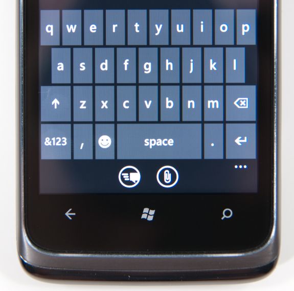
The virtual keyboard is software replaceable under Android. If you don’t like what comes on your phone just download another one. Microsoft took the Apple approach and doesn’t allow swapping of keyboards. Instead, Microsoft put together what it feels is the perfect virtual keyboard. While I won’t call it perfect, it is a nice blend of Apple’s simplicity and the text replacement bar you get with some Android keyboards.
Each keypress has an ultramodern typewriter sound to it. Hold down the shift key and you’ll hear an extra tap indicating that caps lock is now active.
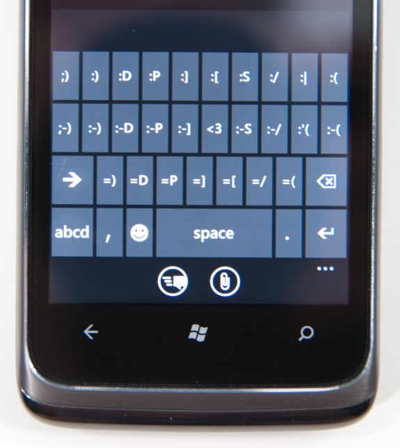
There are three keyboard configurations by default if you’re typing in a text field. The default one is very similar to the iOS keyboard with a few android-like additions. You get a comma and period keys as well as the emoticon button. Tapping the latter gives you two pages of emoticons for your expressive needs.
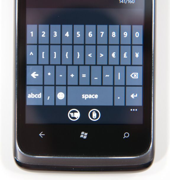
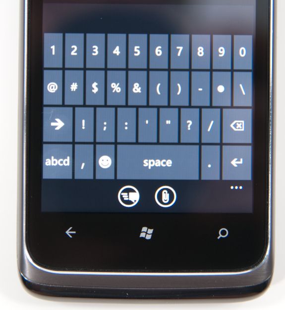
Hit the &123 key and you’ll get numbers and symbols. Hit the right arrow and you’ll see the second page. The numbers remain intact across both symbol keyboards making typing complex passwords a bit easier.
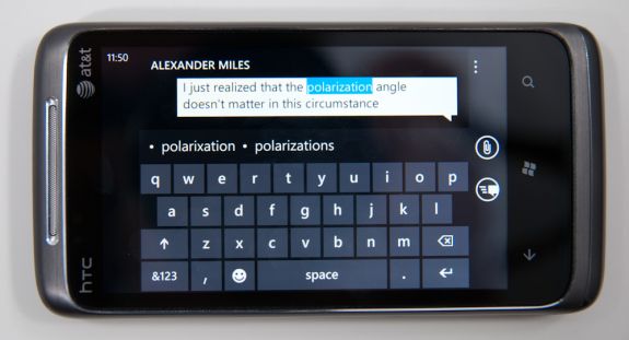
Microsoft doesn’t inject as much key spacing into the keyboard as Apple does, which can throw off iOS users. The learning curve isn’t steep though. The keyboard will autocorrect simple errors. Corrections happen based on length of word typed and location of keys pressed. For more ambiguous errors it’ll present you with a list of options in a bar above the keyboard. You can tap to select a replacement or scroll left/right to find one that may not be among the top suggestions.
If a word incorrectly shows up as misspelled, tap once to highlight and hit the + key in the suggestion bar to add it to the dictionary.
There’s typically a separate confirm/send button below the keyboard for anything that’s a non-recoverable action (e.g. sending an SMS). This is so you don’t accidentally hit enter and send something when you thought you were putting a space in between some lines.
Of course the whole point of a virtual keyboard is that it should change based on the application. Windows Phone 7 is no exception. If you’re typing in a URL box you get a dedicated .com key for example. Typing in an email field gives you dedicated @ and .com key. The calculator app has its own custom keyboard layouts (one for portrait and one for landscape).
To position a cursor in iOS you tap and hold until you get a magnifying lens that helps you fine position your cursor. Android relies on arrow keys or a trackball (optical/physical). Windows Phone once again borrows from Apple. You tap and hold but instead of getting a magnifying lens, a theme-colored cursor appears above your finger. Simply drag your finger down and out of the way to position the cursor exactly where you want it. It feels awkward at first, but it makes a lot of sense once you get used to it.
Overall the keyboard is great. If you’re used to iOS, there’s a bit of an adjustment period but you’ll pick it up right away. If you’re coming from Android (except for Swype) I believe you’ll find it a pleasant balance between iOS and Android keyboards. And if you’ve never used a virtual keyboard before, you couldn’t have a better starting point.




125 Comments
View All Comments
wharris1 - Wednesday, October 20, 2010 - link
Web site is great; now I need to read articledeputc26 - Thursday, October 21, 2010 - link
Where are the actual load times (in seconds) for web pages? Synthetics never tell the whole picture... seems like you might be embarrassed for WP7 on this front ;)GoSharks - Wednesday, October 20, 2010 - link
Are there supposed to be images in this article?jimhsu - Wednesday, October 20, 2010 - link
Article seems to be half done as Anand makes a huge number of edits. Guess that's normal.SelesGames - Wednesday, October 20, 2010 - link
I see images just fine.Btw, I don't know whether any app reviews will be done, but for anyone who has access to a phone, check out some of our apps. Search for "Seles Games" to see all our apps, or check out any of the apps we have demoed here:
http://www.youtube.com/user/aemami99
Mumrik - Saturday, October 23, 2010 - link
So you decided to advertise in the Anandtech comments... Classy move.Termie - Wednesday, October 20, 2010 - link
The HTC Surround page seems to be missing, or at least it's not coming up when I click on the link to that page.Anand Lal Shimpi - Wednesday, October 20, 2010 - link
Images are incoming, please bare with us :)atmartens - Wednesday, October 20, 2010 - link
"please bare with us :)"Skinny dipping? Or just streaking?
Zstream - Wednesday, October 20, 2010 - link
Do you know what the talk time is for the LG? It's not showing on the graph.