Samsung Galaxy S 4 Review - Part 1
by Brian Klug on April 24, 2013 12:01 AM ESTDisplay
We wrote about how we suspected that SGS4 would go to a 5-inch 1080p SAMOLED display just after CES. Turns out that was spot on, as the SGS4 includes a 5-inch 1080p Full HD SAMOLED panel, the latest in Samsung's AMOLED roadmap. Samsung's naming stays true, and there's no Plus tacked on at the end, so we get another non-RGB stripe subpixel geometry with SGS4. The last few Samsung AMOLED variants we've seen have had different subpixel grids, and the one on the SGS4 is possibly the most interesting to date. There's still a bias toward more green subpixels than blue or red, this isn't an RGB stripe at all, but instead of the previous RG,BG layout we see this offset pattern with green on one line, then blue and red on another line. Interestingly enough the blue subpixel appears to be a square, and red and green appear to be circles, with the difference in area possibly offsetting the luminous efficiency of each material. Whatever the reason (Samsung has never been official or forthcoming any of these subpixel patterns each time they've changed them) it's present on the SGS4.
At this size however I have to admit that I find the pursuit of the subpixel geometry more of an educational one than something which affects users. While I could occasionally see it on the SGS3, I definitely do not see it on SGS4. The subpixels are now small enough that whatever the pattern, it all looks like a homogenous light-emitting surface, which was the goal after all. I could bring up the visual acuity discussion again but just trust me that it's small enough to not be visible even with actually perfect (not legally perfect, which is different) vision.
So resolution is great and up to par with all the other LCD-bearing flagships this year, lack of RGB stripe notwithstanding. There's that remaining question about brightness, contrast, outdoor visibility, and of course calibration and the saturation issue that has persisted with AMOLED from generation to generation.
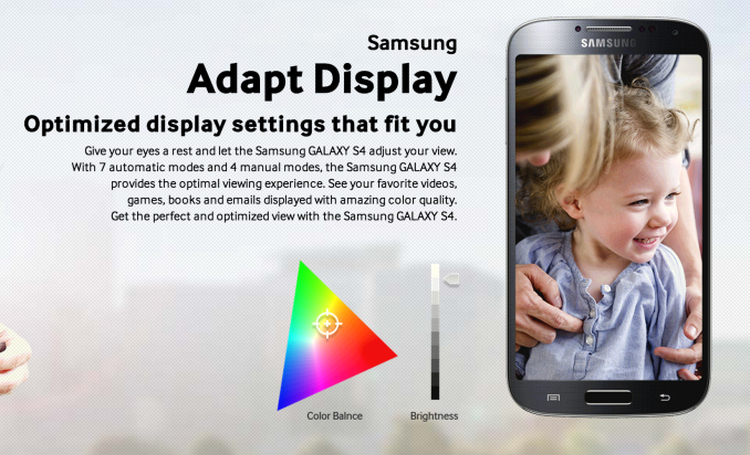
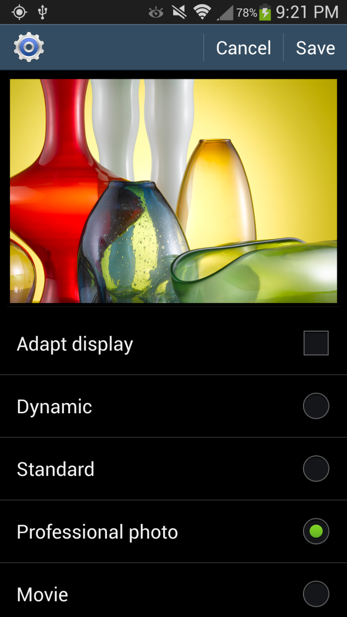
On the brightness front, the SGS4 includes dynamic contrast functions that cannot be disabled and change as a function of what is being displayed. There's an "auto adjust screen tone" checkbox under display but don't let that fool you, that doesn't disable dynamic contrast, just white point. Under screen mode are the mDNIe toggles we've seen on countless other previous Samsung Android phones with AMOLED panels, only here we notice something interesting. There have always been four toggles as long as this option has existed, only what's different is now, one of them is named "Professional photo." Reviews of other regional variants of the SGS4 have included the same button but marked "Adobe RGB." Oddly enough it seems that the North American versions at least have this renamed for some reason, but undoubtedly the function is the same. Many speculated that this is now a toggle for some full CMS (Color Management System) which "fixes" the inherent color space issues with AMOLED and oversaturation that occurs when looking at sRGB content on such devices. Unfortunately, I can confirm that my initial suspicions that this is just a continuation of the mDNIe (lite) settings from previous generation is in fact correct. I reverse engineered what I could of these settings from both kernel messages while changing the toggles, and looking at the kernel sources. Turns out that 'Professional photo' mode is actually the 'Natural' mode renamed from previous versions.
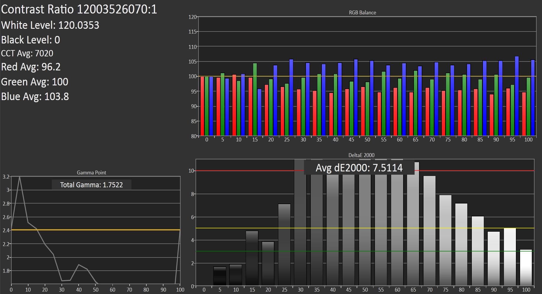
So the question was whether the color space or white point actually does change with this mode enabled. I ran the SGS4 through our display tests in each of the modes and think the full color space plot tells the story. The sanest of them all really ends up being the strangely-named 'Movie' mode. Professional photo gives the big gamut with a white point closer to 'Movie,' which is to say around 7000K, but it doesn't fundamentally change the still-present oversaturation or color management issue that exists in Android with these wide gamut displays. Most users admittedly don't care however and just see "bright" colors. Theres' an Auto mode as well which the device ships with that basically has a matrix of mDNIe settings for targeted applications (for example the Gallery, Browser, Video playback) and so forth get settings, which you can see in the kernel.
| CalMAN Display Comparison | ||||||||||||
| Metric | iPhone 5 | iPhone 4S | HTC One X | SGS3 | Samsung Galaxy Note 2 | Google Nexus 4 | HTC Droid DNA | HTC One | SGS4 | |||
| Grayscale 200nits Avg dE2000 | 3.564 | 6.162 | 6.609 | 4.578 | 5.867 | 7.686 | 6.738 | 5.391 | 7.511 | |||
| CCT Avg (K) | 6925 | 7171 | 5944 | 6809 | 7109 | 8506 | 8108 | 8118 | 7020 | |||
| Saturation Sweep Avg dE2000 | 3.591 | 8.787 | 5.066 | 5.460 | 7.986 | 8.517 | 5.856 | 3.365 | 7.823 | |||
| GMB ColorChecker Avg dE2000 | 4.747 | 6.328 | 6.963 | 7.322 | 8.185 | 7.531 | 6.687 | 4.656 | 7.440 | |||
In the "Movie" mode things are better controlled than the Note 2 on the GMB color checker card test, which is the most important one for me. White point is also no longer the crazy 8000K that we saw before, 7000K is commendable for Samsung at this point. Keep in mind that maximum brightness changes in each mode as well as we effectively clamp things, I measured a maximum of 319 nits in Dynamic mode, 311 nits in Movie mode, and 255 nits in Standard, for example.
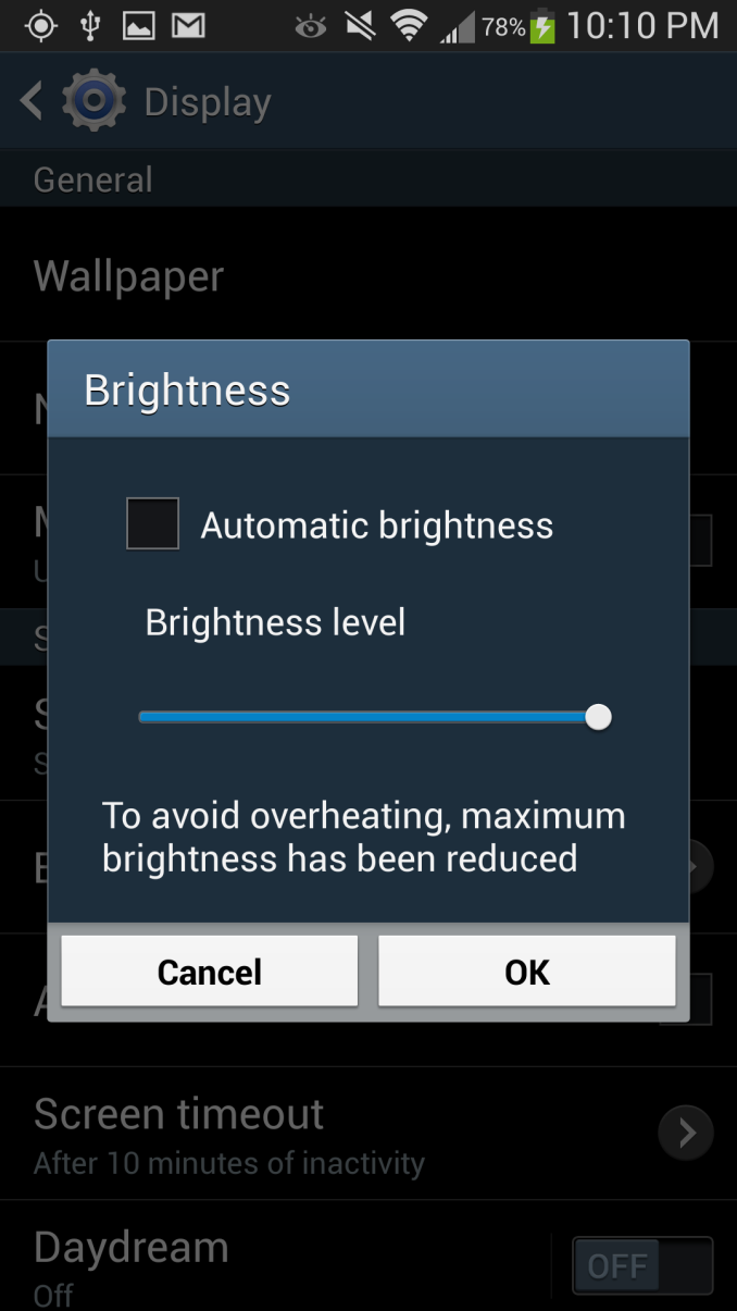
Running the display at maximum brightness for too long will also get you into an overheating or thermal protection mode as well, which we've seen on countless other AMOLED variants. Most of the time I suspect users will run on Auto brightness however which keeps brightness down to a much lower level to save battery and prevent that from becoming a problem.
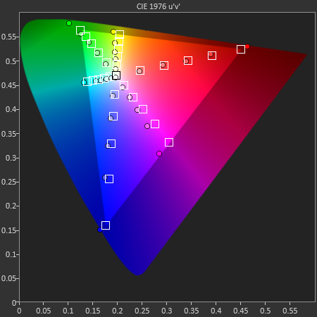
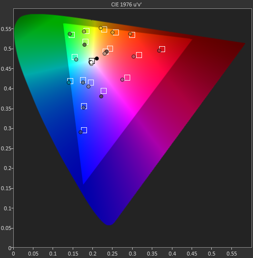
Because "Movie" was the closest to sRGB of all the modes, I selected it for the actual results that I'll present in the table. Admittedly this mode does tighten things up a bit, but it still isn't perfect and I'd still like to see Samsung do something to reign this in at some point.






335 Comments
View All Comments
tarun.chatwith - Wednesday, April 24, 2013 - link
HTC One without a doubt.Enough of plastic
FITCamaro - Wednesday, April 24, 2013 - link
You're just going to wrap it in a plastic/rubber case anyway most likely. So to me it's not much of an issue. I just got a new phone at work and went with the Note 2. Loving it so far. A tad large but I have big hands anyway and can text with holding it in one hand so I'm good.UpSpin - Wednesday, April 24, 2013 - link
Don't generalize. I never used a plastic/rubber case or a screen protector, only used a sleeve/bag to protect and clean the display while in the my pocket. You might enjoy plastic, others enjoy aluminum. Both materials have their advantages and disadvantage, in the end it's a personal decision. However aluminum looks and feels more expensive and looks of higher quality, and considering the price you pay for such a smartphone, it's understandable that people want that the device looks the way it costs.danbob999 - Wednesday, April 24, 2013 - link
It's a phone. Why would you care how expensive it looks?DigitalFreak - Wednesday, April 24, 2013 - link
VanityThud2 - Thursday, April 25, 2013 - link
The vanity of trying not to appear vain.darwinosx - Wednesday, April 24, 2013 - link
Because when you pay money for something you want it to look and feel good. Obviously.Notmyusualid - Wednesday, April 24, 2013 - link
+1danbob999 - Wednesday, April 24, 2013 - link
Even if it means being larger, heavier, with a smaller display, a smaller battery, and no more resistant?UpSpin - Wednesday, April 24, 2013 - link
But this isn't the case here. It has a larger bezel because of dual front speakers which are obviously better than mono back speakers. As long as it's comfortably weighted, heavier doesn't mean worse. (see complaints about too light iPhone). The display is smaller, but the size is a personal decision. The battery life is identical or even better, not worse. The shiny plastic gets easier dirty, is softer and easier to scratch than the anodized aluminum, it's also easier to break thin parts of the frame and thus buttons than to break a unibody case. But alumium is easier to dent.