Motorola Droid 3 Review - Third Time's a Charm
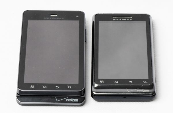
by Brian Klug on July 30, 2011 12:01 AM ESTThe Droid 3 also takes an incredible number of design nods from the Droid X2 (and its physically identical cousin, the Droid X). In fact, I’d almost consider the Droid 3 more of a Droid X2 with keyboard than an in-place update of the Droid 2. Almost every single side has some language from the X2’s design vocabulary.
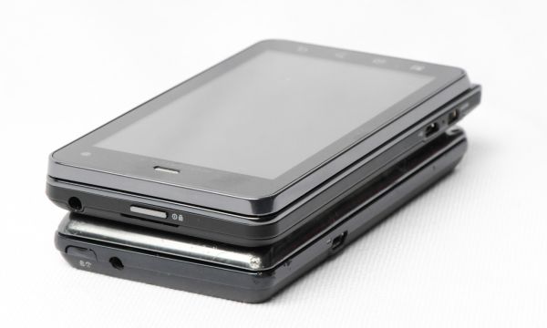
Starting up at the very top is an incredibly similar power and lock button, which juts out squarely from the center. This is just like the Droid X2 button, and a huge departure from the Droid 2’s rounded, off-center design. The headphone jack is on the far side and hangs over the edge slightly. There’s also a small gap for prying the battery cover off the Droid 3, which also does double duty as a port for one of the Droid 3’s three microphones. The power button is easy to locate thanks to it jutting out by almost one mm, and has a communicative click. I always did find that the Droid 2’s rounded button made the device seem sleek, but made powering the thing on sometimes a challenge unless you always put your finger on the button immediately.
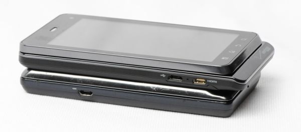
The part of the Droid 3 that I find most similar to the X2 is the left side, which includes a microUSB and microHDMI (type D) port on the bottom quarter. In-between the two is a small circle that looks like it was intended to accommodate a charging LED (which the Droid and Droid 2 both placed next to the microUSB port), instead it serves no such purpose and seems to be an afterthought. I should note that the Droid 3 box doesn’t include a microHDMI to HDMI cable, so you’ll wind up having to order one if you want to try HDMI mirroring, which the Droid 3 does support.
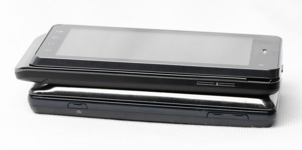
The bottom of the Droid 3 still includes the lip motif that the original Droid started, however the bottom part of the lip is no longer incorporated into top display piece which slides. Dead center and right where the display piece ends is the main microphone for voice. This bottom lip is coated with a glossy chrome material that shows fingerprints, as is the entire display lip. The gap between the display and bottom slider portion is just shy of a fingernail, and thankfully there’s very little flex with the device closed. We’ll go into more detail about the slider in a second.
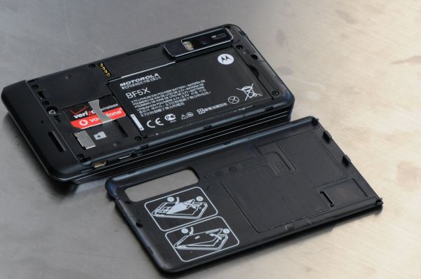
The back of the Droid 3 is no longer a single metal piece, instead it’s one large snap-on plastic part. Getting the battery door off is almost as harrowing on the Droid 3 as it is on the Nokia N900 - jam a thumb in, then pry the entire affair off. No matter how many times I do this, it’s an unnerving experience.
Behind that door is the Motorola’s 5.7 Whr battery, which is larger in terms of capacity and different in size compared to the Droid 2 battery. It’s a different model number entirely, so you’re unfortunately out of luck if you’re a previous generation Droid owner with a small collection of batteries.
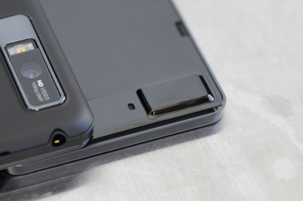
Next to it is the SIM card slot, which of course comes prepopulated a Verizon/Vodafone SIM you’ll need to activate if you want to roam abroad. The other option is of course to call, ask politely for (or buy) an unlock, but more on that later. Adjacent to the SIM slot is the microSD card slot, which comes without any preinstalled card. That’s right, there’s no microSD card provided with the Droid 3, instead I guess the logic is that 16 GB of internal storage supplants the need for potentially slower SD card based storage. You can always add one of your own, however. There are also four gold pogo pins also on the back of the device which make contact with the Droid 3’s optional inductive charging battery cover.
Below that is the speakerphone port, which has a slightly raised top side to prevent it from laying completely coplanar and being muffled by a table. There’s a nice mesh grille preventing grime from getting inside too far in the speakerphone port. Dead center is another microphone for noise cancellation and for use with some fancy DSP when recording video.
On the far right side is another interesting change, gone is the dual-detent camera button completely, just like the Droid X2. It’s a change I think will initially confuse existing Droid users, especially because of how notable the camera button was in previously differentiating the device. At the very top is the volume rocker, which is one solid piece of plastic that pivots. It’s nice and clicky, thankfully. There’s also a small gap up near the volume buttons which a corresponding bulge on the display slider mates into.
This is what keeps the Droid 3’s slider mechanism so firm when the phone is closed and in portrait mode. It doesn’t oreo effect at all or have much play at all. When being slid out, the same applies until the bottom part extends beyond the bulge.






84 Comments
View All Comments
EndlessChris - Saturday, July 30, 2011 - link
Great review as always. Looks like this will be my new phone :)RaistlinZ - Saturday, July 30, 2011 - link
Sharp lookin' phone. I like.vol7ron - Sunday, July 31, 2011 - link
I like this too, larger screen, nice looking keyboard, great looking device. It seems to have it all.One thing, does it really have a 0.3MP front-facing camera? I would suspect 1.3MP would be more realistic, especially since there are probably economies of scale for that technology right now.
Thx,
vol7ron
Brian Klug - Friday, August 5, 2011 - link
Vol7ron,It definitely does have a 0.3 MP (VGA) front facing camera. http://developer.motorola.com/products/droid-3-xt8...
I'd like to see 1.3 MP sensors on the front for sure, but at this point it doesn't make sense until both the per-pixel quality is the same (same size pixels) and there are apps that can actually do some HD teleconferencing (like if Skype had support). We're almost there though.
-Brian
Myrandex - Monday, August 1, 2011 - link
It would be for me if it wasn't for this bastardization that Verizon did:The obvious next part of the story is that WCDMA HSPA+ 14.4 Mbps connectivity. Unfortunately, Verizon has locked the retail Droid 3 out of seeing USA-based GSM/WCDMA networks with an MCC (Mobile Country Code) lock.
Why can't Verizon just allow the hardware to perform at its fullest rather than finding some way to lock it down? They have always been terrible about locking their phones in some way.
Jason Cook
themossie - Saturday, July 30, 2011 - link
Tried the Droid 3 in store the day it came out, mixed feelings about the screen.Found it very usable for applications, not usable for serious reading (news, ebooks, etc). First time I've suffered eyestrain from an LCD screen with decent brightness and contrast. Droid 1 works great for this use case.
Brian, Anand and the rest of the AnandTech team - any opinions on this? Anyone else?
themossie - Saturday, July 30, 2011 - link
Also, thanks for the great review - business as usual at Anandtech!steven75 - Saturday, July 30, 2011 - link
Indeed. Can't believe he tried to equate this pentile display with less resolution in a larger screen size (significantly worse PPI) with the retina display. They aren't even close.bplewis24 - Saturday, July 30, 2011 - link
I'll trust the guy who looks at hundreds of phones per year over the hyperbolic masses who troll the internet.I'll also trust my own eyes and science, which prove you wrong.
Finraziel - Sunday, July 31, 2011 - link
Well, I'll also trust my own eyes, and the picture right above where Brian says he doesn't mind pentile too much really makes the droid3's screen look like crap compared to the lower resolution droid2 right next to it. My experience with other pentile screens also suggests there's absolutely no point in increasing the resolution only by using a trick like this, you end up with noticably lower effective resolution. I'd prefer an actually sharp screen over impressive specifications.I really hope when the 720p screen phones come out in the next half year or so they wont be using cheap tricks like this.