Motorola Droid 3 Review - Third Time's a Charm
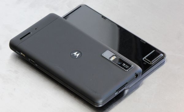
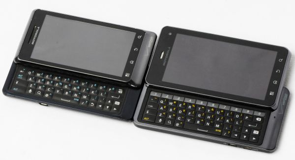
by Brian Klug on July 30, 2011 12:01 AM ESTJust like the other Droids, this model’s slider lacks any spring assistance, instead it slides out along a friction-guided two-rail track. It’s pretty obvious where that friction happens and where the slider locks into the display part, given the two small notches at the top, and likewise where the tracks are at the extreme left and right. Initially I found the Droid 3 slider a bit resistive and not super smooth, however after a few days of use it settled into a much better and smoother groove.
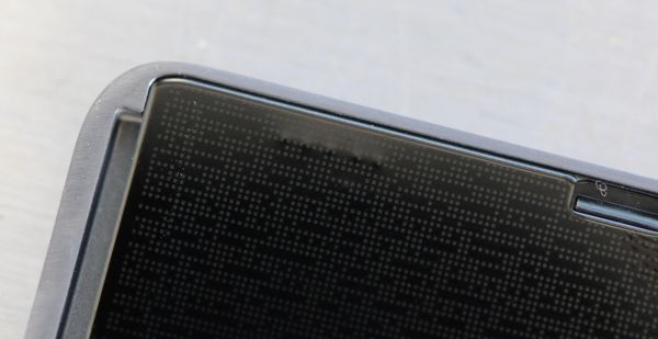
It still isn’t quite as fluid as HTC’s latest designs, but again gets the job done with an impressive thickness (or lack thereof). The back of the display is topped with a reflective, patterned surface which also unfortunately collects fingerprints.
So how is the keyboard that the slider makes possible? In a word - amazing. Yes, it quite literally is the closest to perfect I’ve seen in a very long time. Each iteration of Motorola Droid keyboards has gotten slightly better, starting with the almost unusable Droid 1’s concave keys which had minimal feedback, to the mid-cycle refresh which changed key domes to convex, followed up by the Droid 2 which removed the D-pad and improved communication, and now the Droid 3.
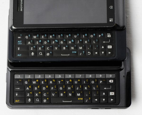
The Droid 3 adds a fifth keyboard row, this time dedicated exclusively to the arabic numerals. I originally thought having numerics wouldn’t make much sense, but after entering my 20-character WPA PSK for probably the hundredth time followed by the usual assortment of passwords for email and google accounts, it finally made sense. Having a row dedicated to numerics just makes so much sense in retrospect, both for entering phone numbers in messaging, passwords, and so many other situations.
The numerical row also does double duty by acting as a buffer between the top row of the latin characters and the top display slider. My only major complaint with the Droid 2 and before was that there was very little space between this top row and the display slider - if you had any fingernails at all or even just large fingers, they’d likely collide with that slider when typing on the top row. Now, having one more (even half height) row makes that a solved problem.
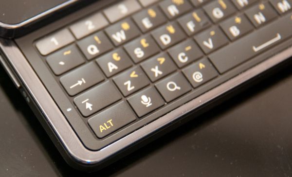
The keys on the Droid 2 previously had little space between them, it was primarily one large piece without a discrete gap between characters. The Droid 3 now includes a shiny plastic layer between keys, which will no doubt show lots of grime in due time, but it does make each key independently clicky.
The only rearrangements to speak of are the removal of alt-lock and the back keys, and repositioning of the tab key. The bottom row also is slightly shifted to the left. Material and tactile feel on these new domes are excellent. Again, the keys are convex, topped in a soft matte texture, and communicatively clicky. Motorola takes a nod from Apple with a caps-lock indicator that nicely disappears into the lip on the left next to the shift key - it’s a nice touch which makes the caps lock indicator visible even with a finger on the button.
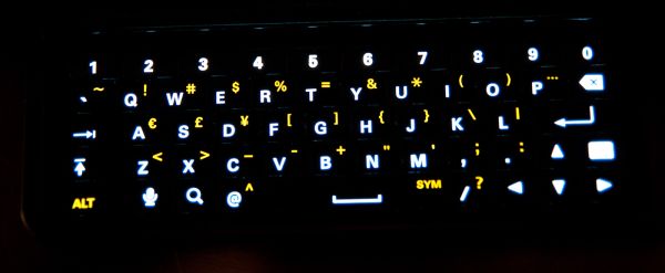
Backlighting on the Droid 3 keyboard is nice and even. There aren’t any controls in settings for controlling when the backlight comes on or how long until it turns off. Backlighting seems to turn on and remain on when ambient brightness is under a certain level. Alongside the Droid 2, the Droid 3 seems very conservative with its keyboard backlighting, as it seems to enable it at a notably lower ambient light level than its predecessor.
The capacitive buttons are likewise backlit the same way they have been on previous Motorola Droids, and thankfully the order of these respective Android keys are unchanged from the Droid 2 to 3. There’s a bit of capacitive button backlight bleed at the bottom of the display where the glass ends and meets plastic, but it isn’t too distracting.
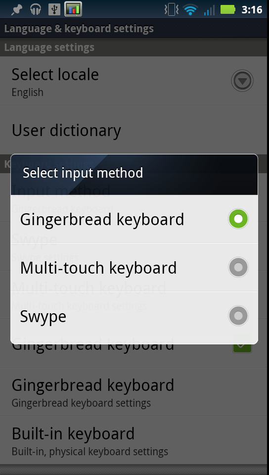
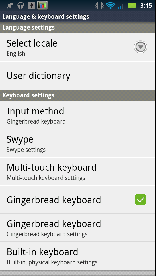
Since we’ve been talking about the keyboard, I think it’s worth mentioning that the Droid 3 continues the Motorola legacy of including a host of software keyboard options for portrait view. Swype, the default Motorola multi-touch keyboard, and the Android 2.3 stock gingerbread keyboard are all preinstalled an available as options. I’m glad the Droid 3 doesn’t do away with the gingerbread keyboard, like I’ve seen other Android 2.3.x handsets do. Swype is themed to look like Motoblur, and the multi-touch keyboard is as good as it always has been on other Motorola Android devices.
The last part is that there’s another pane in the input and keyboards settings page for the hardware keyboard with a few options. What feels neglected is how anemic the hardware keyboard auto-replace engine is. Compared with the gingerbread and even Motorola multi-touch keyboards, the hardware keyboard has an almost non-existant auto-replace engine for fixing misspelled words. In practice, it does little more than correct things like “im” to “I’m,” and so forth. It’d be nice to see the hardware keyboard get a bit more love.




84 Comments
View All Comments
EndlessChris - Saturday, July 30, 2011 - link
Great review as always. Looks like this will be my new phone :)RaistlinZ - Saturday, July 30, 2011 - link
Sharp lookin' phone. I like.vol7ron - Sunday, July 31, 2011 - link
I like this too, larger screen, nice looking keyboard, great looking device. It seems to have it all.One thing, does it really have a 0.3MP front-facing camera? I would suspect 1.3MP would be more realistic, especially since there are probably economies of scale for that technology right now.
Thx,
vol7ron
Brian Klug - Friday, August 5, 2011 - link
Vol7ron,It definitely does have a 0.3 MP (VGA) front facing camera. http://developer.motorola.com/products/droid-3-xt8...
I'd like to see 1.3 MP sensors on the front for sure, but at this point it doesn't make sense until both the per-pixel quality is the same (same size pixels) and there are apps that can actually do some HD teleconferencing (like if Skype had support). We're almost there though.
-Brian
Myrandex - Monday, August 1, 2011 - link
It would be for me if it wasn't for this bastardization that Verizon did:The obvious next part of the story is that WCDMA HSPA+ 14.4 Mbps connectivity. Unfortunately, Verizon has locked the retail Droid 3 out of seeing USA-based GSM/WCDMA networks with an MCC (Mobile Country Code) lock.
Why can't Verizon just allow the hardware to perform at its fullest rather than finding some way to lock it down? They have always been terrible about locking their phones in some way.
Jason Cook
themossie - Saturday, July 30, 2011 - link
Tried the Droid 3 in store the day it came out, mixed feelings about the screen.Found it very usable for applications, not usable for serious reading (news, ebooks, etc). First time I've suffered eyestrain from an LCD screen with decent brightness and contrast. Droid 1 works great for this use case.
Brian, Anand and the rest of the AnandTech team - any opinions on this? Anyone else?
themossie - Saturday, July 30, 2011 - link
Also, thanks for the great review - business as usual at Anandtech!steven75 - Saturday, July 30, 2011 - link
Indeed. Can't believe he tried to equate this pentile display with less resolution in a larger screen size (significantly worse PPI) with the retina display. They aren't even close.bplewis24 - Saturday, July 30, 2011 - link
I'll trust the guy who looks at hundreds of phones per year over the hyperbolic masses who troll the internet.I'll also trust my own eyes and science, which prove you wrong.
Finraziel - Sunday, July 31, 2011 - link
Well, I'll also trust my own eyes, and the picture right above where Brian says he doesn't mind pentile too much really makes the droid3's screen look like crap compared to the lower resolution droid2 right next to it. My experience with other pentile screens also suggests there's absolutely no point in increasing the resolution only by using a trick like this, you end up with noticably lower effective resolution. I'd prefer an actually sharp screen over impressive specifications.I really hope when the 720p screen phones come out in the next half year or so they wont be using cheap tricks like this.